We’ve been working with the Carrier team on strategic branding and digital marketing consulting assignments for over 5 years. Earlier this year, they spun off of United Technologies, becoming their own stand alone, publicly traded company. One of their growth pillars as the “New Carrier” is service. Coming from a company that is steeped in product development, innovation and execution, building up the service side of their business required more than a little attention– they needed a full on commitment starting with creating a brand.
For our part, we guided the Carrier team through our brand strategy frameworks, starting with a discovery process where we studied the competitive landscape, dove into understanding the customer and their motivations, and had dozens of calls with teammates across the globe to understand the internal perspective. We then worked through a brand model and positioning that clearly defined the purpose of the brand and what makes this new Carrier service unique and highly valuable to the intended audience.
Our brand model includes brand belief, vision, mission, values, audience, problem, promise, and tone. A subset of the model becomes the brand positioning. These pieces are critical to building a strong brand. Without them, the brand lacks a foundation to stand up on.
Armed with solid brand strategy, we went to work on making the brand come to life with a name, then a logo. We brainstormed over 150 names in 5 different categories, then worked with the Carrier team to narrow the list to 3 choices. The final name for the new service brand, based on how well it fit the criteria (e.g. short, modern, easy to say, easy to understand, works globally, fits with Carrier, etc.) and the test results is BluEdge. The word “Blu” and the color blue creates a tie to Carrier. “Edge” is a word that creates a link to the service offering’s digital side, at the forefront of service technology, like remote monitoring, as well as being on the front edge with customers.

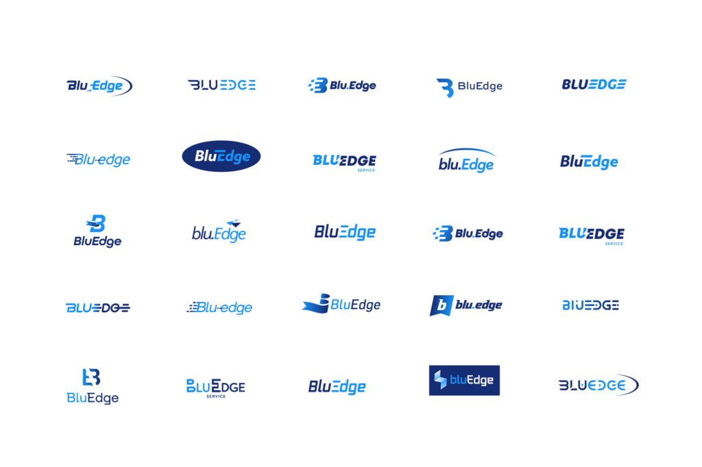
Creating a logo for BluEdge required a rapid exploration of design directions to meet the deadline of the external announcement. Considerations going into the work included:
- The brand model and positioning
- The Carrier corporate brand and brand guidelines
- Communicating movement
With those three key things in mind, we delved into a rapid exploration process. Could we find something interesting in the B, the other letters, the space between them, or even around them? One important factor to take into consideration was ensuring the logo for this new brand sat cohesively alongside the existing Carrier brand identity. Our challenge was to find the balance between Carrier’s legacy and the classic visual style of its brand, while also creating a strong visual representation of the new service brand’s forward-thinking and modern edge in the market.
We started by quickly and roughly getting out all the ideas that came to mind, experimenting with custom letterforms, abstract and geometric shapes, simple flat vector graphics, and more involved gradients and transparencies, all with the goal of finding that sweet spot between old and new, history and future. We explored ideas around excellence, momentum, futurism, negative space, thinking about the mark itself and how to find what best represented all that Carrier would accomplish with this new service brand.

After some early exploration, we established that the brand identity needed to directly reference the Carrier brand, be it with the use of the brand font, our color choices, using a graphical element that has a subtle nod to the Carrier oval, or all of the above. With this in mind, we started narrowing in on less abstract representations for the brand mark, honing in on a blue color scheme and further refining the typography of the wordmark.

Psychology of shapes in logos have a significant influence on brand perception. An oval, like a circle or an ellipse, is usually associated with continuity and security as it has no beginning or end. This rounded shape has no angles, making it friendly and approachable and setting a positive tone for the brand association. As such, we decided to borrow part of the Carrier oval shape to create a forward moving swoosh that contained the momentum of the wordmark, grounding it, and honoring the primary Carrier brand.
It was also important that the logo look and feel like it’s moving to reflect the brand’s forward progress and future-thinking. The wordmark in the logo features a bold, confident type slightly angled to give the appearance of movement. The B features a sharp point stemming from the left side, and the E extends from the U to symbolize progression. There is also a gradient in the middle “e” and several angular lines and edges, and the word “BluEdge” pushes into the concave shape of the oval to imply forward motion.
Color consistency was another way we connected BluEdge to the Carrier brand. The future of service lies at the intersection of soft people skills and digital innovation. This is represented by each of the Carrier blues: the lighter blue speaks to the softer, more human side of service, while the darker blue adds an edge that represents forward-thinking, innovation and advanced technologies. The gradient in the middle of these two colors represents that the BluEdge service platform brand exists where these two meet.

We are really proud of the strategic and creative branding work we did to develop this new service brand, BluEdge, and get it launched to Carrier’s customers. Our work went beyond what we’ve captured here to include brand guides, master creative for a brand campaign, a launch kit, versions of a brand video, and more. The brand is making a big impact on their business, with over 300 service agreements signed in the six weeks since BluEdge launched.
For more on this project, see our work page.
This blog post is Co-Authored by Carolyn Walker and Tanya Kanner.