Project: Stony Creek Brewery
Overview
Our conversation with Stony Creek began around the theme of new beginnings. They had been in the market for awhile and had some success getting their product on- and off-premise. However, they knew it was time to shake things up. They were opening up a new brewery, brought on a new brewmaster, and had a new vision for their brand.
The Insight
Craft beer enthusiasts crave novelty and will pay a premium, but are overwhelmed with the amount of choices they have and instead seek out styles when they don’t immediately recognize a brand.
Approach
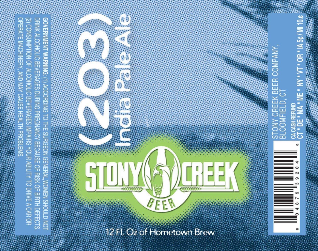
We set out to develop a brand that was consistent across the various styles and series in order to be recognizable by the consumer, but also maintained a freshness that showcased that it was consistently rolling out new products that satisfied the craft beer drinker’s quest for exploration. During our conversations with the Stony Creek team we honed in on the brand mantra of “Aggressively Laid-Back Beer.” The beer was going to be aggressive in its approach to brewing style and experimentation, while the brewery’s waterside location was the perfect expression of a laid-back lifestyle we were tying to the product.
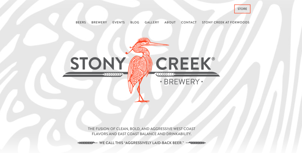
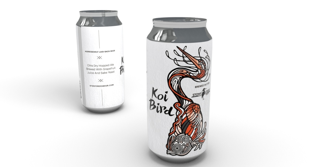
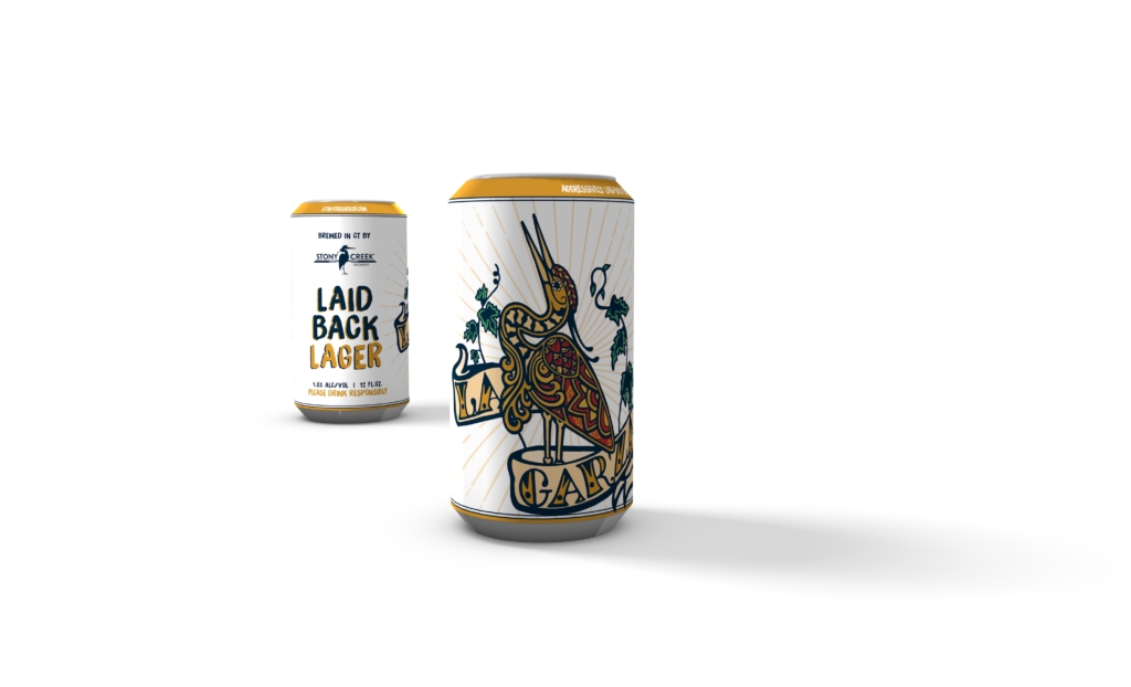
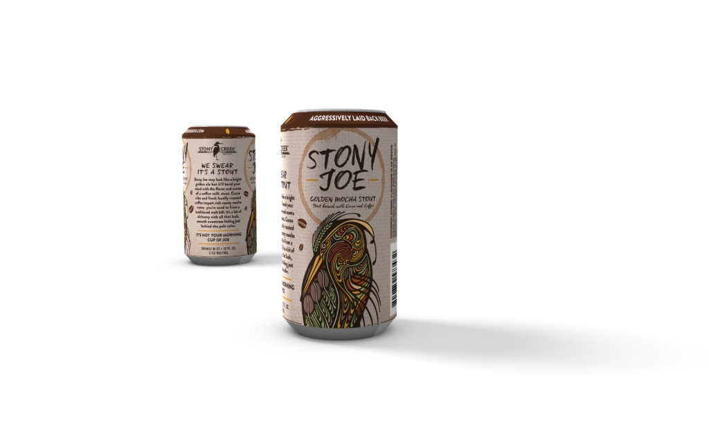
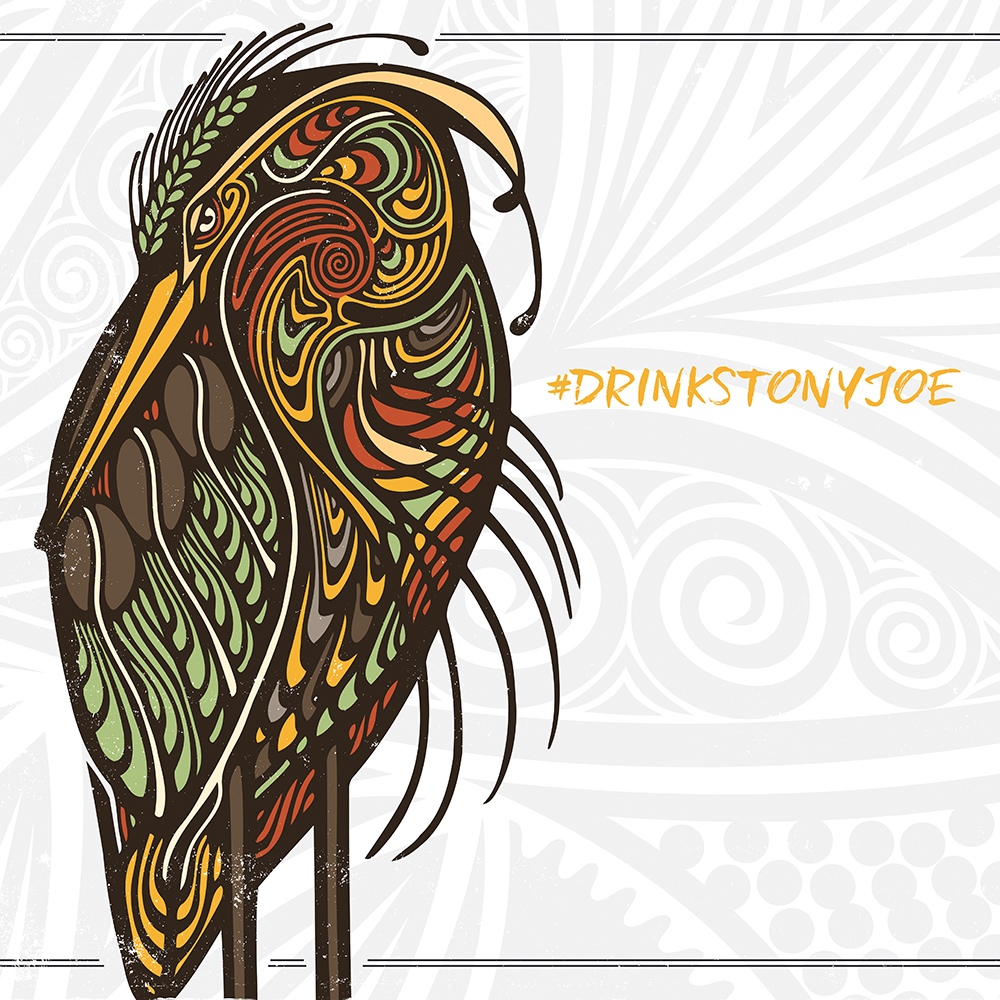
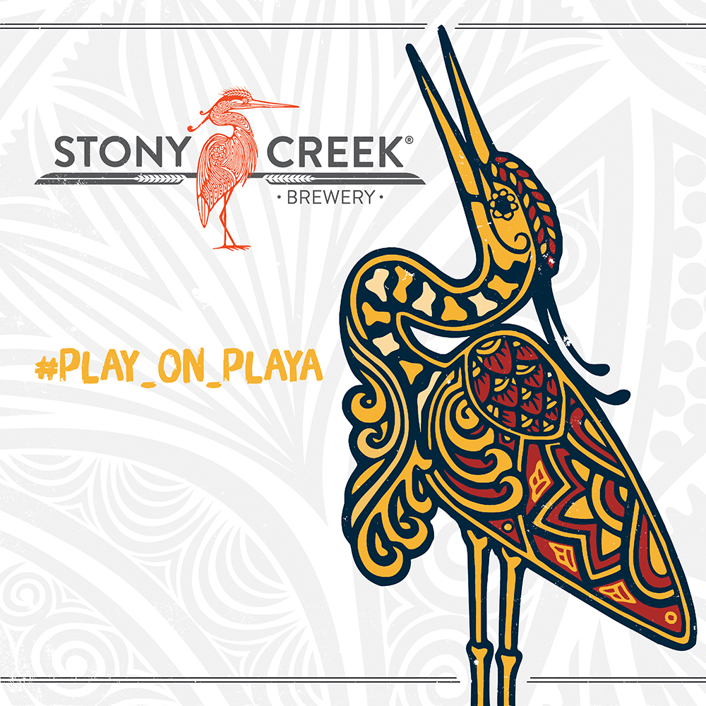
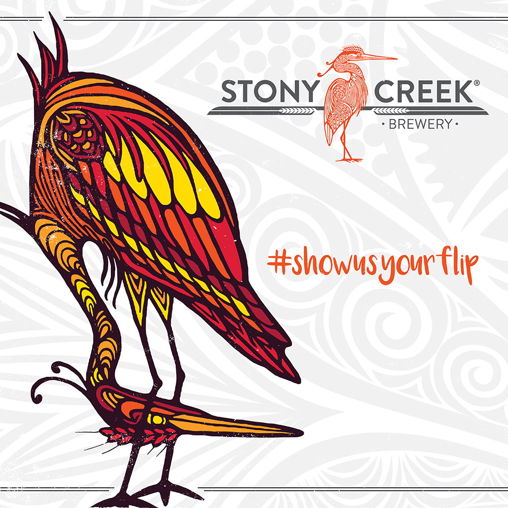
We wanted to introduce the idea of “brand magnetism” by bringing forth the heron that was previously buried in their logo. The heron is a seaside bird that is known for its big personality.
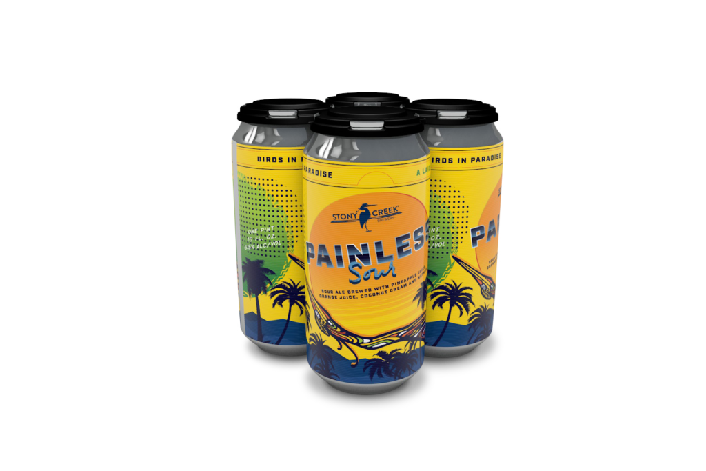
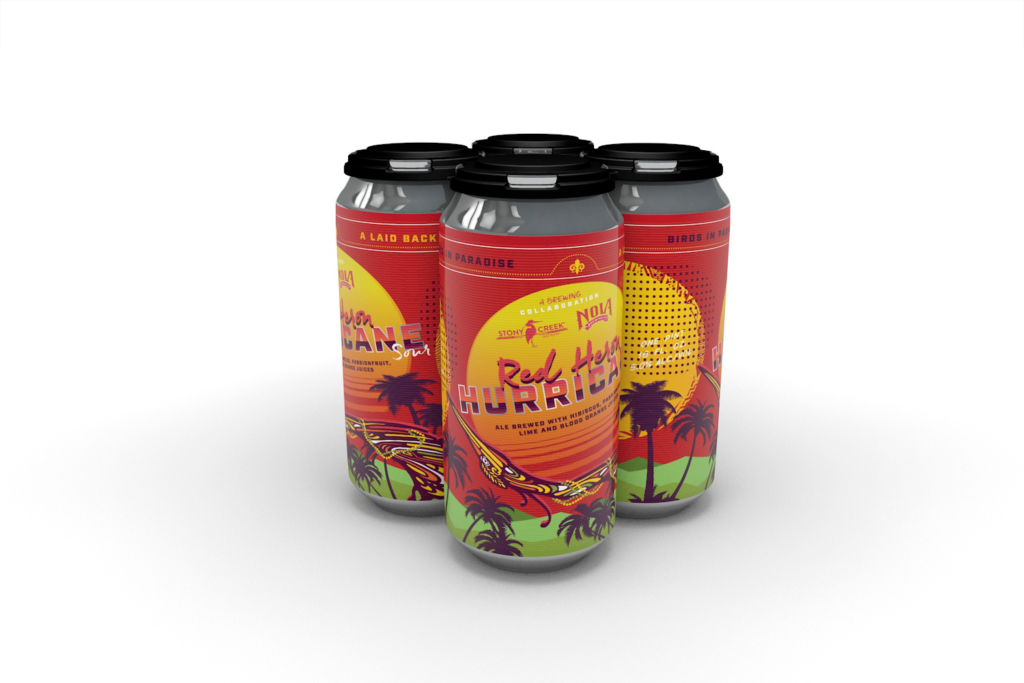
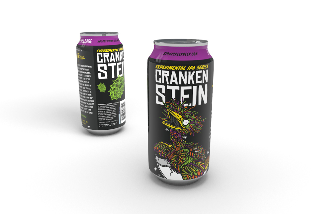
Knowing the overabundance of craft beers on the market and the overwhelming choices that consumers are faced when in a store, we wanted our packaging to visually grab attention. Our approach was to create a fresh, vibrant, bright, and colorful aesthetic.
“We wanted to introduce the idea of ‘brand magnetism'”
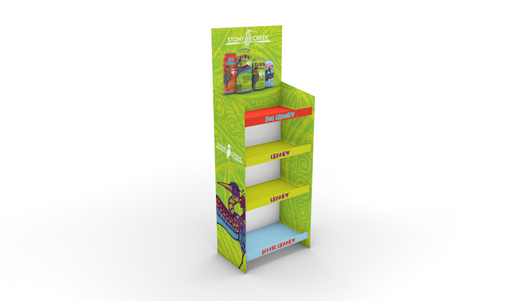
We developed in-store case stackers in order to help retail partners sell product through to consumers and create prime merchandising space for the brand.
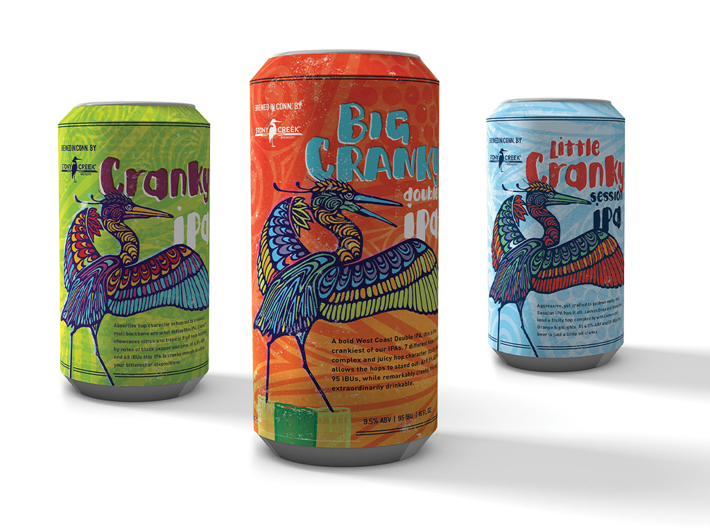
As new styles and series were introduced rapidly, we maintained consistency across the various cans by utilizing the bird in different positions and poses. Each color is meant to capture the flavor notes in each beer.
We incorporated small moments of delight within the website. Subtle animations brought the Stony Creek heron to life and breathes some life into the site experience.
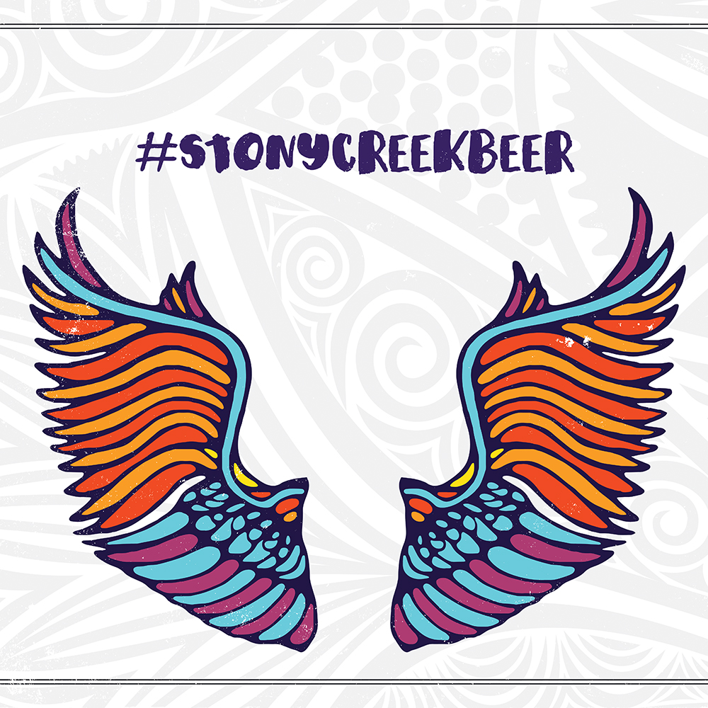
Working with a tattoo artist, Lisa Sotero, each graphic gave us the opportunity to make a statement with it’s intricate detail.
Entrance signage at the brewery created moments that were meant to be shared on social media.
Results
Successful brands are built when effective marketing is layered on top of a great product and operations. Our partnership with Stony Creek Brewery is a perfect illustration of this.
- Surpassed year 3 sales projections in year 1
- “Big Cranky” has become the fourth best-selling craft beer in all of New England
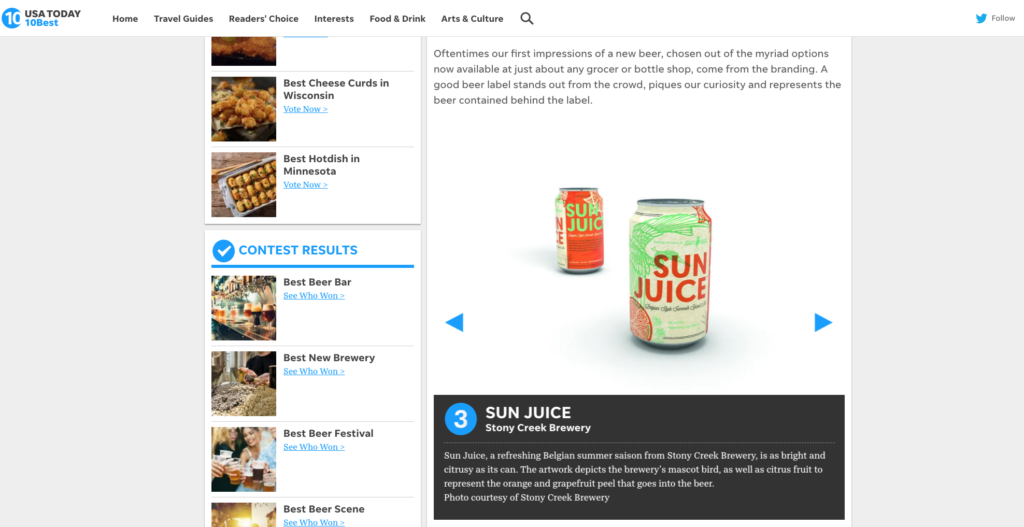
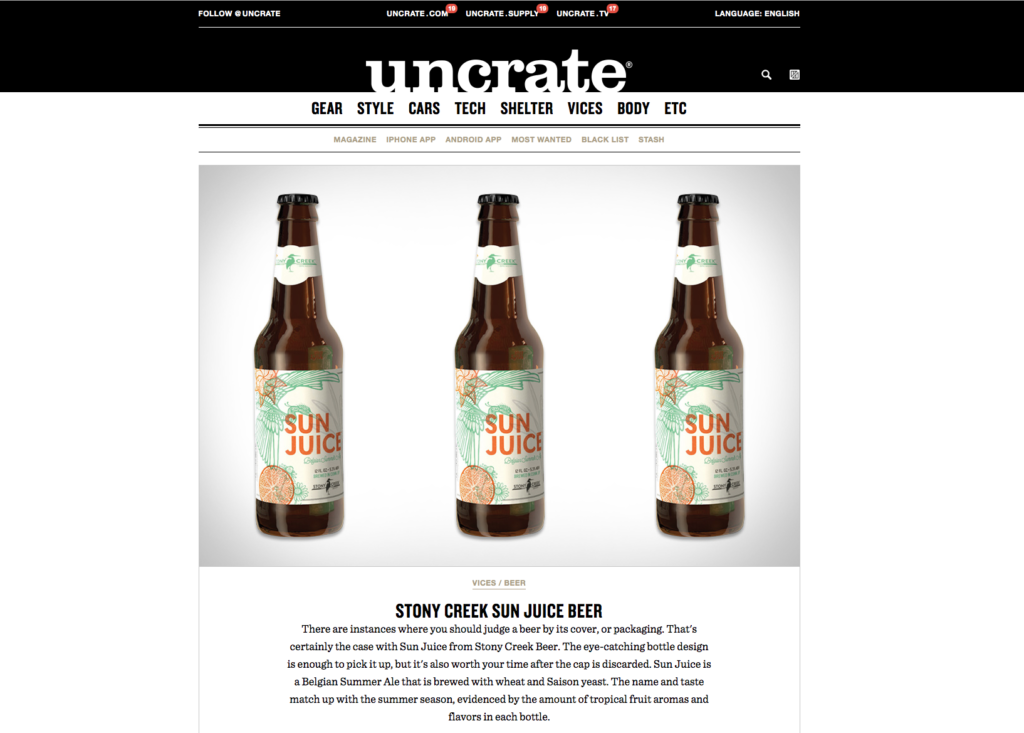
- Several press features on the packaging design including USA Today’s “10 Best” and uncrate.
More Intro text