Clean Beauty Redefined
We all know there’s more to beauty than what’s on the surface. Especially when it comes to e-commerce. Luxury skincare brand Luzern originally came to us to help optimize their site's performance. What we delivered was a holistic solution that enhanced their overall digital experience.
Scope of Work
For almost 20 years, Luzern has been transforming the world of beauty with their line of organic skincare products. Originally sold through partners in the spa industry, they branched out to sell their blends to their loyal fanbase through their website. We audited their site, identified areas of improvement, and implemented solutions beyond the creative brief that radically improved user experience and product sales.

DETAILS
Client
Luzern
Deliverables
- Web
- Photography
- Advertising (Digital)
Photography
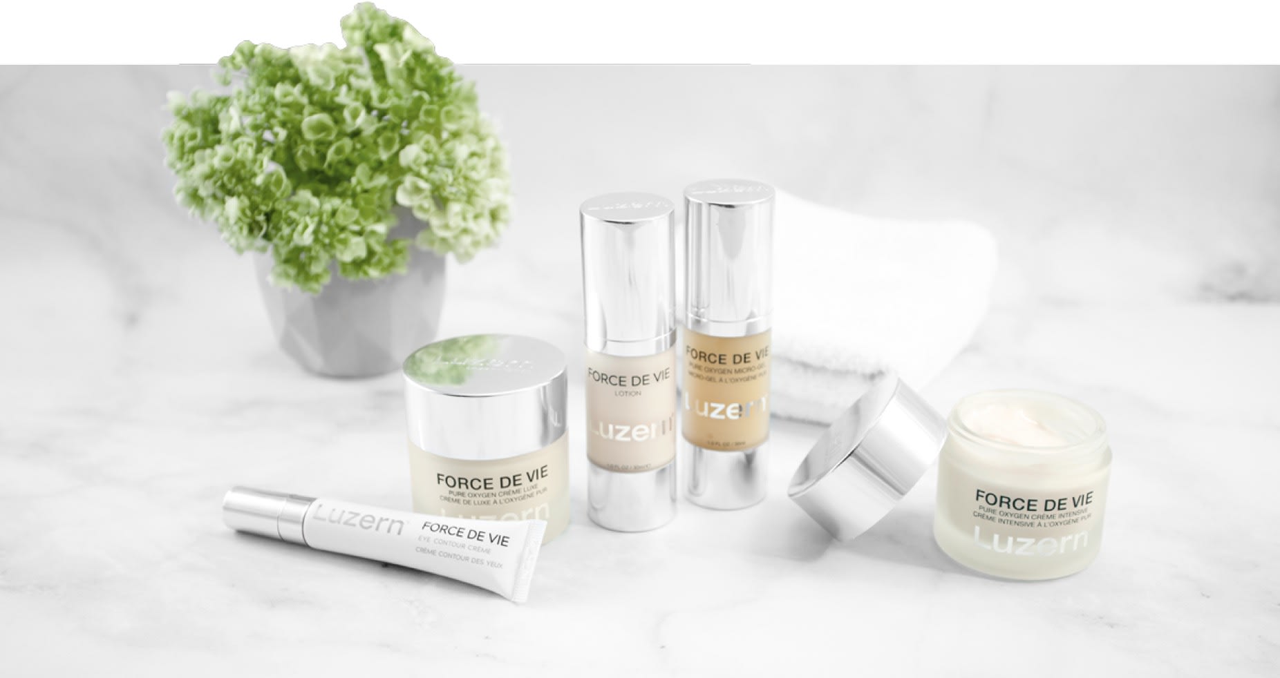
While our dev team built a new Shopify experience, our design team executed a new style of photography throughout the site that featured marble as a backdrop for their line of products. This provided a luxurious, high end feel while remaining true to their roots in nature - a perfect setting for their all natural and organic blends to shine.


A New Site
The improved site speed and fresh content gave users an easy way to explore the site and purchase their favorite products.
Migrating the site to a new e-commerce platform dramtically changed the user experience right from the start. We simplified the shopping experience, increased page speed, removed problematic plugins, and drastically reduced technical debt which allowed admins to focus on adding compelling content as opposed to wrestling code.


