A Best-In-Class Digital Experience
A restaurant’s website is a valuable tool to inform guests, increase foot traffic, enrich the brand’s story, and make a great impression. We combined best practices with innovative design thinking to created a digital experience that sets the standard for the polished casual restaurant industry and beyond.
Scope of Work
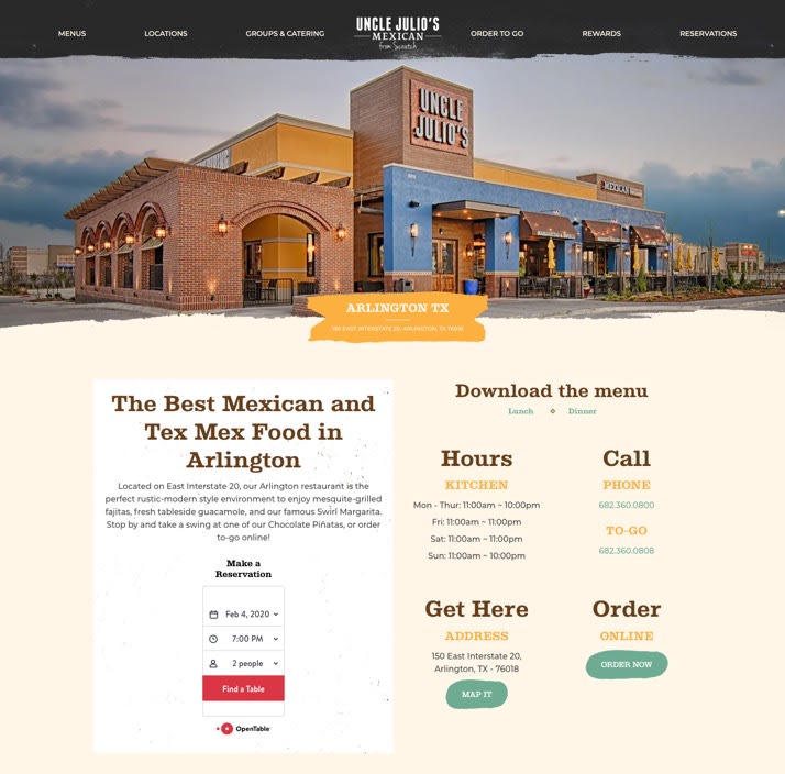
Before pushing a single pixel, we conducted preliminary research to better understand our audience and how they were using both Uncle Julio’s site and the sites of their competitors. Building on these rich insights, we were able to streamline content and navigation to create a site that’s optimized for the actual needs and behaviors of the end-user. And, using hand-drawn textural design elements, the site now looks and feels handcrafted while matching the rustic-modern aesthetic of Uncle Julio’s dining rooms.

DETAILS
Client
Uncle Julios
Deliverables
- Website Design
- Website Development
- UX Strategy
- Copywriting
First, some stats since we launched the redesign:
39%
Increase in site speed
42%
Increase in menu Views
32%
Increase in group dining bookings
54%
Increase in online gift card sales
127%
Increase visits across all location pages
23%
Increase in session duration

An Audit of Their Existing Site
We conducted a full audit of their existing site and identified inconsistencies, friction in the user experience, and repetitive content.

Outdated Styling
Cumbersome UX
Info Redundancies
Matching The Brand To Their Audience
Our research revealed Uncle Julio's audience includes a segment that we’ve defined as "luxury lite." To reach these more affluent consumers who appreciate elevated experiences, we needed to overhaul their website’s styling to utilize a more premium look and feel.


Site Mapping
Building on our research, we mapped out the most important pages of the site and tailored the menu so that it’s intuitive and simple for visitors to find what they’re really looking for.
Style Guide
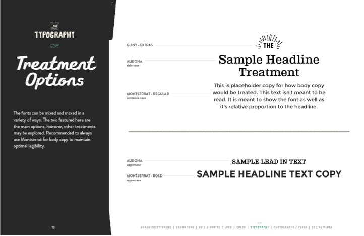
To elevate Uncle Julio's brand, we designed a style guide with extensible elements that could be used both in the site's redesign and serve their ever-expanding locations and innovative new dishes.


Designing with
Mobile in Mind
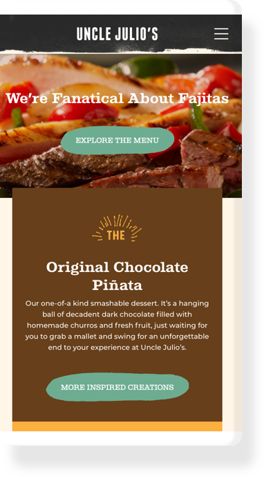
Since 75% of Uncle Julio’s traffic comes from smartphones and tablets, it was imperative that we focused every detail toward the mobile user. From site speed to navigation, we made sure we delievered content in a fast and memorable way without sacrificing the overall experience.
Seamless Customization
Today's digital audience expects content that is tailored to their personal experience. We built a fully adminable backend so that each user can receive custom messaging based on their location, favorite restaurant, day of the week, time of day, and much more.


Your Favorite Location
All 36 of Uncle Julio's restaurants have their own location page with relevant information easily accessible. And the site will remember the last location a user visited, so the menu, directions, and store hours will easily be available for their next visit.


