Aggressively Laid Back
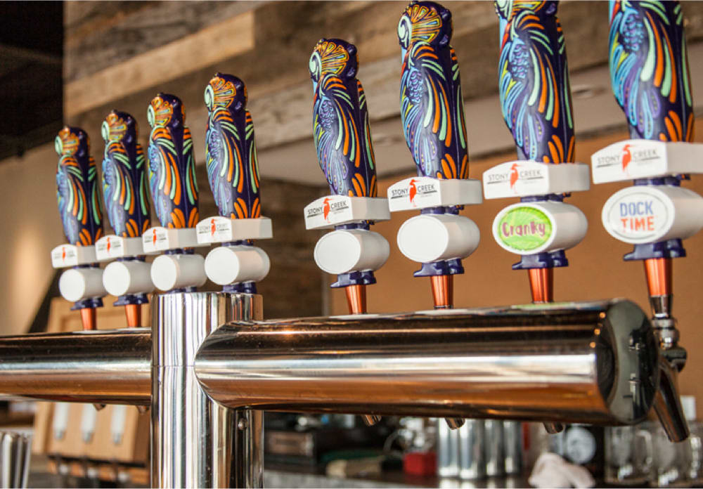
Stony Creek is one of the fastest-growing breweries in the northeast. But, craft beer is competitive and Stony Creek needed a look that was as bold as their beer. So we created brand visuals that make people take notice.
Scope of Work
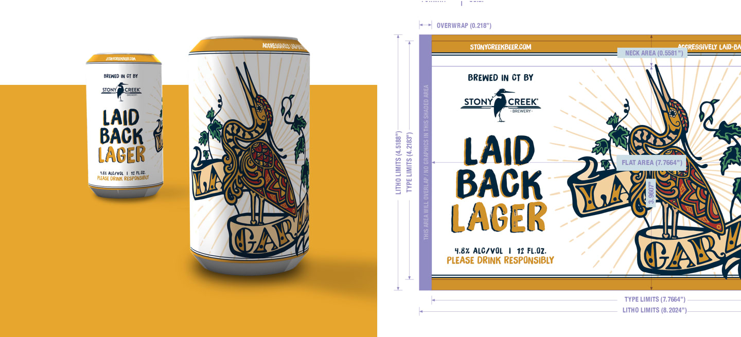
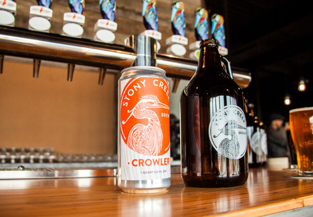
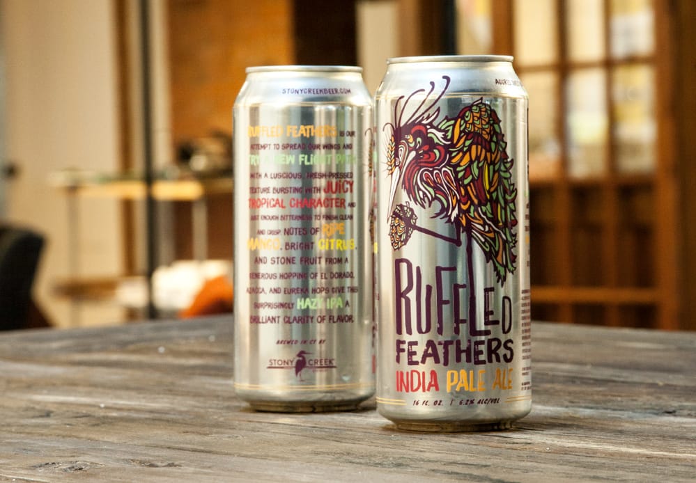
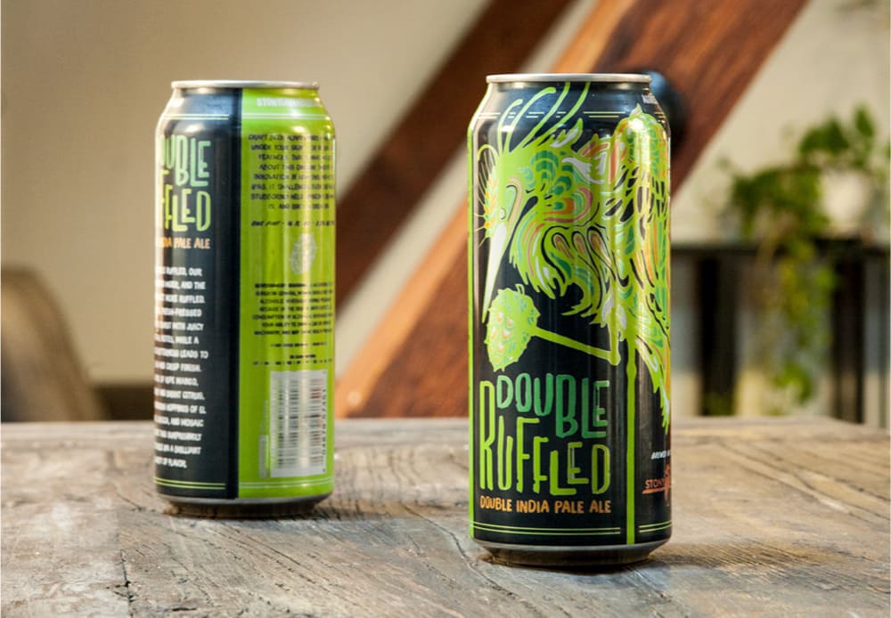
Through vibrant colors and leveraging the magnetism of the Stony Creek heron we set out to capture the "aggressively laid back" vibe of the brand and created packaging that's bound to catch your eye.
DETAILS
Client
Stony Creek Brewery
Deliverables
- Website Design + Development
- Branding
- Strategy
- Packaging


The Cranky Series
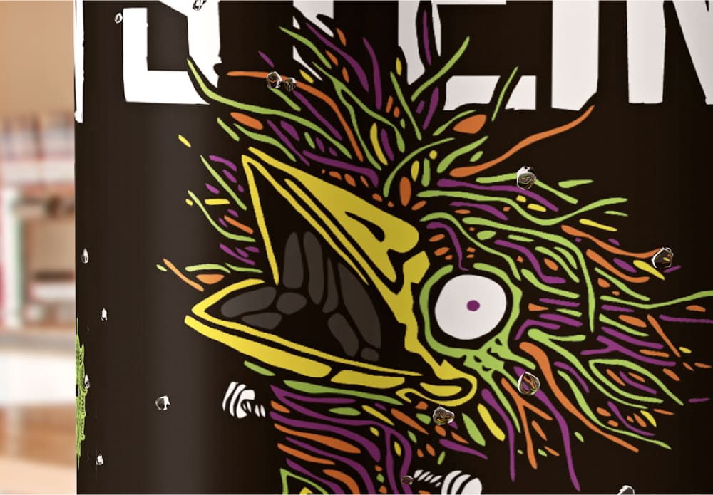
The heron gets its nickname “Cranky” from its raucous voice. It was only fitting that this series of IPAs used fittingly raucous colors.
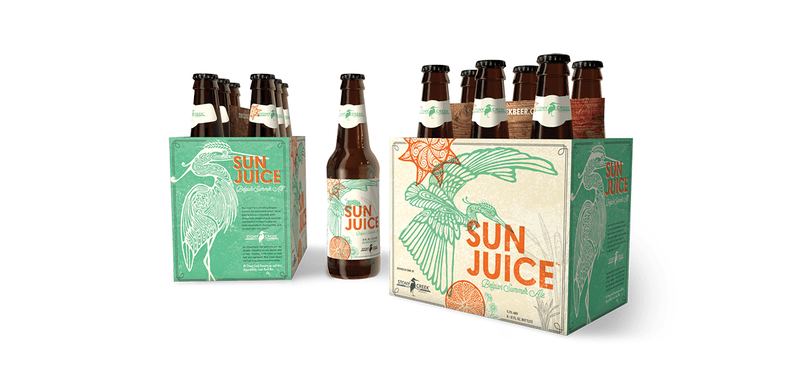
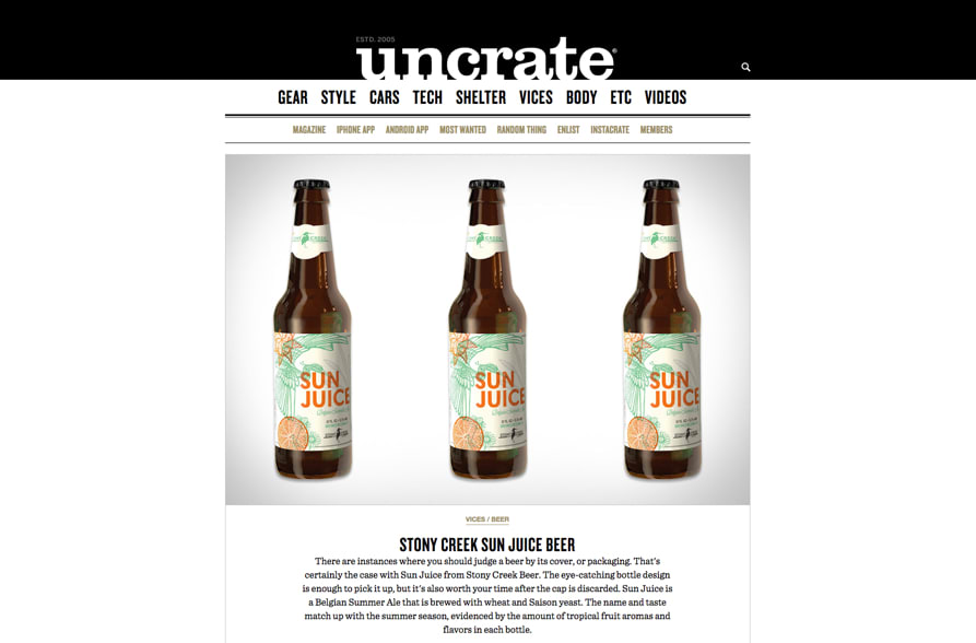
SunJuice/UnCrate
There are instances where you should judge a beer by its cover, or packaging. That's certainly the case with Sun Juice from Stony Creek Beer. The eye-catching bottle design is enough to pick it up.
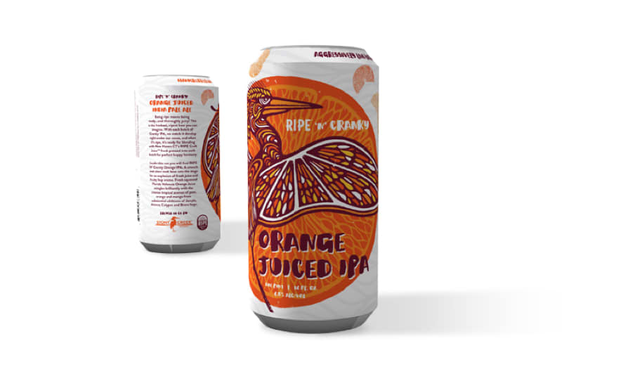
Ripe N’ Cranky Series
Ripe 'N' Cranky blends Stony Creek's flagship IPA with fresh, cold-pressed juice. Our can design similarly paired their signature "cranky" heron with the textures and colors of fresh juice.



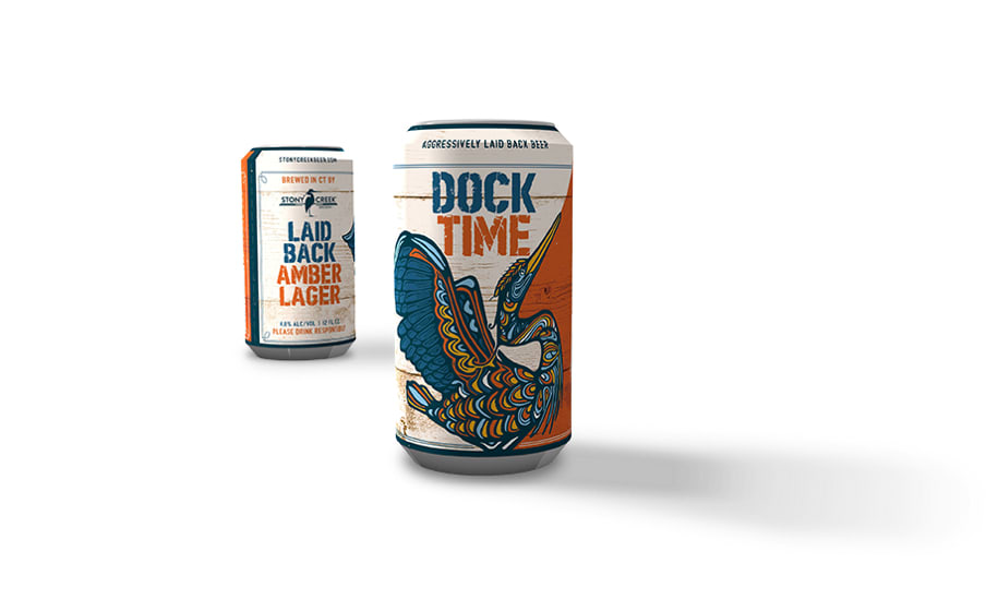
DockTime/Birds in Paradise
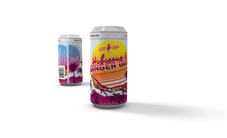
From the flagship DockTime to the limited edition Birds in Paradise series of sour beers, we wanted to capture the taste notes of these amazing beers in the cans.

Website
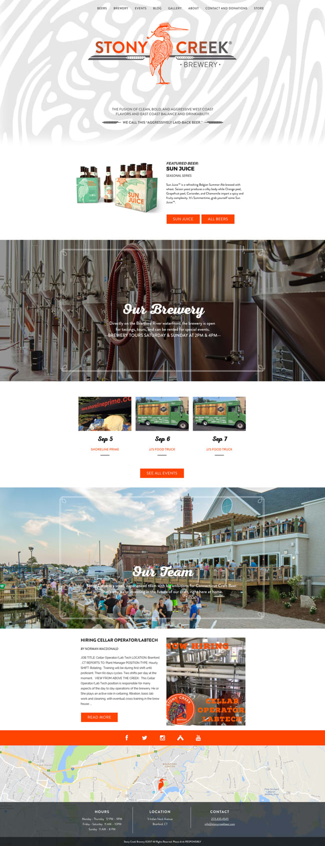
We extended the new look and feel from their packaging to a digital experience. It was important that the site featured both the vibrant atmosphere of their riverfront brewery, as well as the distinct styles of their beer.
Visit Site
